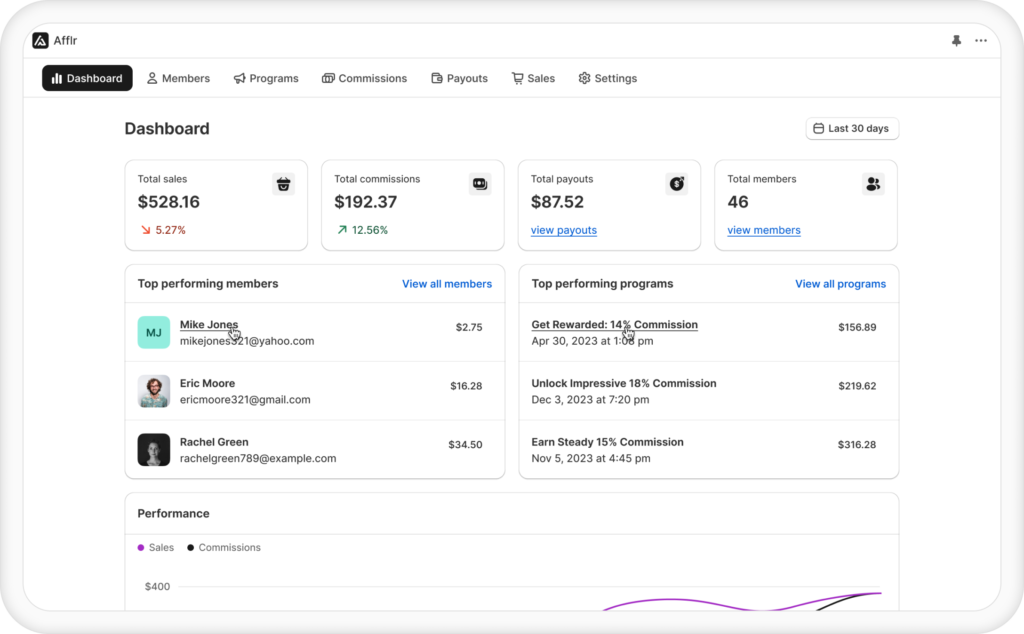
Creating a warm welcome to the curious audience who end up on your affiliate landing page will encourage them to stay longer to explore and indulge.
Captivating the right brand advocates for Affiliate marketing highly depends on how the affiliate program is projected to them. The partner program landing page serves as a pivotal platform for communicating the vision and scope of marketing.
Maximizing affiliate earnings is possible by mastering the art of optimizing landing pages for affiliates to allure the targeted audience and compel them to take action by signing up.
Want to spark interest in a single sight? Create a compelling affiliate landing page using Afflr.
What is an affiliate landing page?
An Affiliate landing page is a web page part of the business’s website that is exclusively dedicated to providing details about the affiliate marketing of the Shopify store.
This page comprehensively provides affiliates with essential information, encompassing program specifics such as affiliate commission structures, product particulars, supplementary benefits, and guidelines for sign-up.
Building a landing page for a partner program that suits well with the affiliate website’s aesthetic while effectively directing affiliate traffic towards the affiliate website is pivotal to contributing to the success of your word-of-mouth marketing endeavor.
A landing page usually has a definite structure to follow that includes a compelling headline, appealing visual design, concise yet informative content, and a clear call to action
How to Create a Landing Page for Affiliate Marketing?
To create a landing page for affiliate marketing, you need to be aware of the right steps to concentrate on to bring maximum affiliate traffic. Some of the major factors to consider are:
- Engaging Headlines: The first impression when a potential affiliate discovers the affiliate landing page can make or break the deal. Craft a compelling headline that is concise yet attractive and draws affiliates in, guiding them through the page to the call to action. Integrate the pain points you aim to address through the business so that the affiliate marketer sees relevancy and potential in association with the brand.
- Stunning Visual Design: Images have a unique power to convey what words cannot, instantly capturing attention. The visual aesthetics of the landing page for a partner program ought to align with the business’s vision and tone. Humans process visuals faster so employ the right experts to customize a style for you or use an existing referral landing page template that suits your needs.
- Glowing Testimonials: Nothing benefits referral marketing more than showcasing happy customers to build trust. Decorate your affiliate landing page with reviews that paint your brand in a positive light. Provide visiting affiliate marketers with ample social proof, demonstrating why they should choose to affiliate with you.
- Direct Calls-to-Action: A common trait of some of the high-converting landing pages is the fact that they have clear direction on how interested affiliates can proceed to sign up for the affiliate program. Additionally, analyzing click data on CTAs can aid in refining metrics to enhance overall performance.
- Unique Brand Differentiator: Tell your audience why your brand is over others. Conduct thorough research on your target audience to understand their needs and interests. Highlight what sets you apart, emphasizing your unique selling points and value proposition.
- Use Automation Tools: There are affiliate marketing apps that let you design your affiliate landing page along with streamlining your affiliate programs. Leveraging these automation tools allows you to design according to your preferences, without requiring complex coding skills.
- SEO Optimization: Affiliate landing page optimization can be achieved by making it SEO-friendly. Analyze the keywords relevant to your business and integrate them seamlessly not only in content but also in title, URL, and CTA. This will help your affiliate website rank at the top, ultimately driving more affiliate traffic.
Benefits of Affiliate Landing Page
There are various benefits of affiliate landing pages in bringing conversions and boosting brand value. They are:
- Leave Good First Impressions: Presenting a concise and structured affiliate landing page is key to communicating the brand’s objective effectively through clear language and compelling visuals. This initial impression sets the tone for a positive user experience and builds interest in the brand.
- High Conversions: A meticulously crafted affiliate landing page with comprehensive product specifications, benefits to join the program, and affiliate commission rates will encourage affiliates to sign up and boost conversion rates effectively.
- Increase Audience Engagement: Clear CTAs will help engagement. By guiding visitors through the desired actions and interactions, the affiliate landing page maximizes audience engagement and encourages sign-ups.
- Establishing Credibility: Featuring social proof and outlining affiliate benefits will enhance the page’s credibility, showcasing the brand’s authenticity.
- Communicate Effectively: Organizing affiliate landing pages with concise headings, program details, and a prominent CTA, ensures clarity and easy comprehension
Capture the attention of affiliates and retain it by creating a visually captivating representation of your affiliate programs using Afflr
13 Striking Affiliate Landing Page Examples
We present to you striking affiliate landing page examples. This will inspire you and educate you on best practices for designing landing pages for affiliate marketing
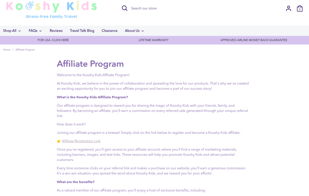
1. Kooshy Kids
This Shopify store specializes in children’s apparel. They have adopted a straightforward approach on their page. However, it lacks visual design, relying solely on lengthy write-ups.
Takeaways to consider from this page:
- Offers benefits
- Steps to be followed to join their affiliate program
2. Pro Breeze
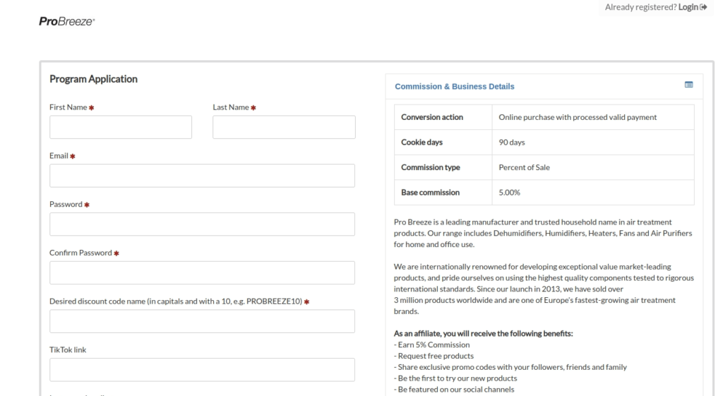
Pro Breeze sells air conditioners, air coolers, and fans. They have a separate landing page for referral programs and affiliate programs. This is an easy way to manage both marketing with ease. Even though their landing page isn’t aesthetic, they have all the information that will be needed by affiliate partners in a single place.
Takeaways to consider from this page:
- Their page has a very clear table explaining commission rate and duration for easy understanding
- They have a sign-up form that directs interested affiliates to sign up easily without much confusion
3. ISOTunes
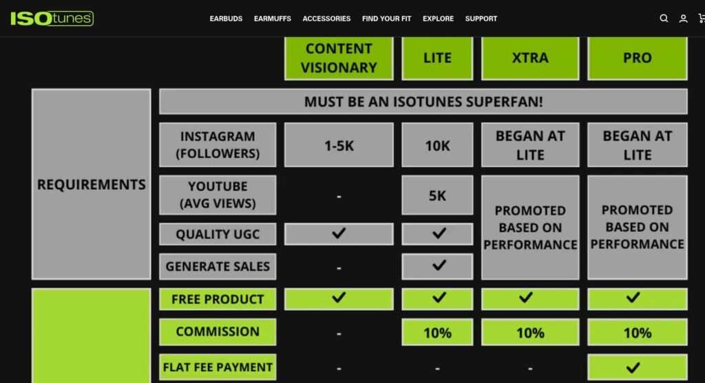
Their business deals with selling earphones for ear protection that is suitable for professionals working in industries and also other parts like cords and windscreens. Their referral and affiliate landing pages stay true to the whole theme of their Shopify store.
Takeaways to consider from this page:
- Information regarding their ambassador program is clearly depicted in the form of a table
- Their CTA is visually easy to spot
4. Maho
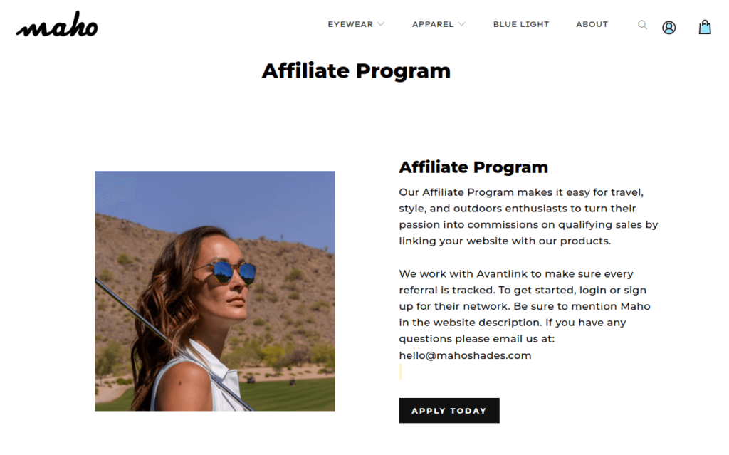
Maho, a lifestyle brand specializing in eyewear, presents a minimal and sleek affiliate landing page aligned with its brand’s vision.
Takeaways to consider from this page:
- Seamless promotion of product photos enhances visual appeal and effectively showcases their eyewear range
5. Burlap & Barrel
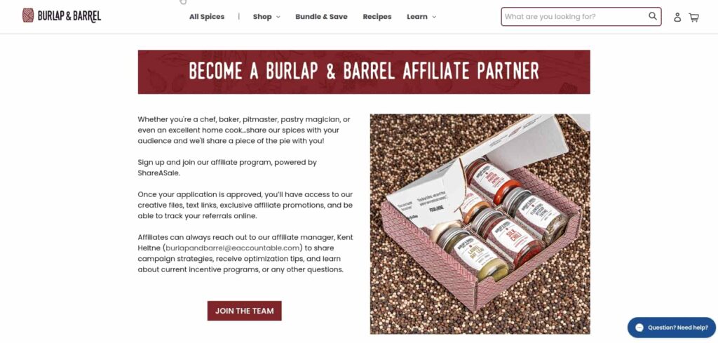
Burlap & Barrel is a Shopify store that sells spices of all varieties. Their affiliate landing page is easy to locate and easy to navigate.
Takeaways to consider from this page:
- Their content is just one page in length including all needed information in precise form.
- They have included their product photo along with clear CTA
6. Lather
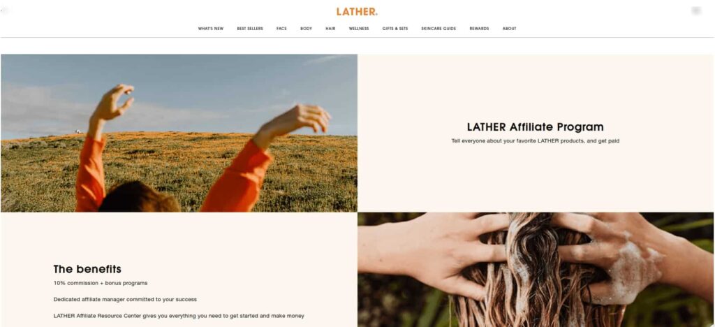
Lather, a wellness brand offering a diverse range of products. They have an aesthetic and minimalist referral landing page design.
Takeaways to consider from this page:
- Emphasis on simplicity and clarity in content ensures easy comprehension for visitors
7. Allbirds
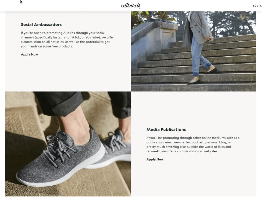
Allbirds makes sustainable footwear and apparel that prioritize comfort and style. Their landing page has their product photo as well as product benefits to attract new affiliate partners.
Takeaways to consider from this page:
- They have clear and separate descriptions for social ambassadors and media publications that wish to be their affiliates.
- Both types of affiliates are directed with individual CTA
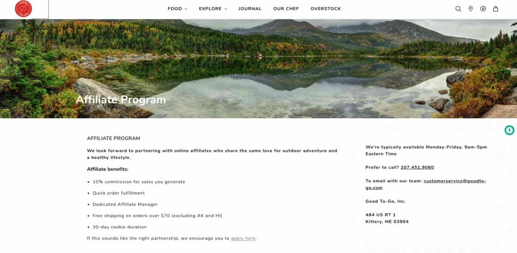
8. Good to Go
They deal with producing convenient food packets for on-the-go consumption during travel. They have a concise and to-the-point affiliate marketing landing page.
Takeaways to consider from this page:
- The landing page for affiliate marketers effectively communicates all necessary details, ensuring clarity and efficiency in information delivery.
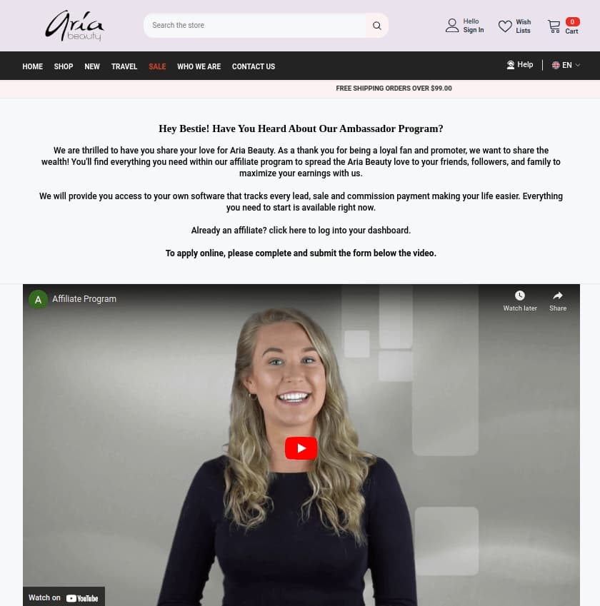
9. Aria Beauty
It’s a beauty brand offering a range of hair care essentials, featuring a straightforward referral landing page. While the content is informative, it needs features to attract and engage customers.
Takeaways to consider from this page:
- Integration of a video aids in clarifying the affiliate program details, enhancing understanding and engagement.
- The promise to provide affiliate tracking software adds value and credibility to the program
10. Jackalo
Jackalo offers apparel for both kids and adults. Their landing page greets visitors with a captivating headline on their welcoming page.
Takeaways to consider from this page:
- They provide means to join an affiliate network encouraging potential affiliates to join.
- Explicitly stating that the program is exclusively for press and large bloggers sets clear expectations and eligibility criteria, streamlining the affiliate recruitment process.

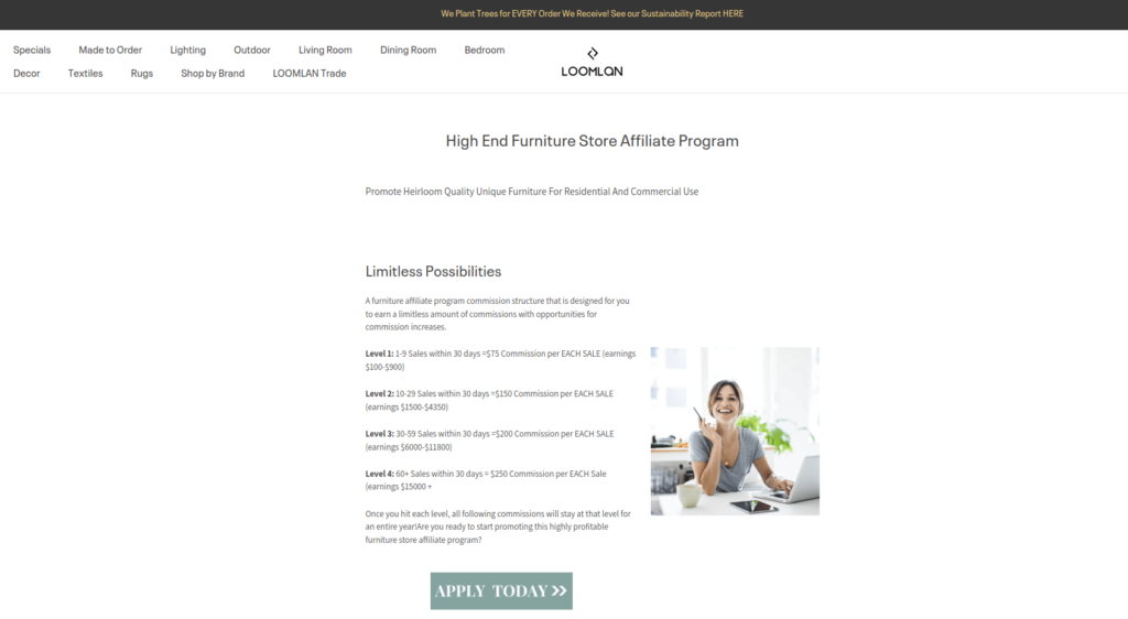
11. Loomlon
It’s a furniture and decor business with an affiliate landing page that effectively communicates benefits and features a vivid CTA in place.
Takeaways to consider from this page:
- The landing page provides a clear explanation of their tiered commission structure, helping potential affiliates understand the earning potential and incentives.
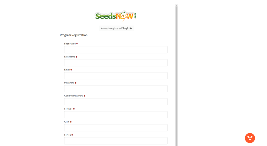
12. SeedsNow
SeedsNow specializes in offering a wide variety of seeds. Their landing page prominently features their program vision and affiliate commission rates.
Takeaways to consider from this page:
- The presence of a detailed sign-up page allows interested affiliates to easily register and join the program.
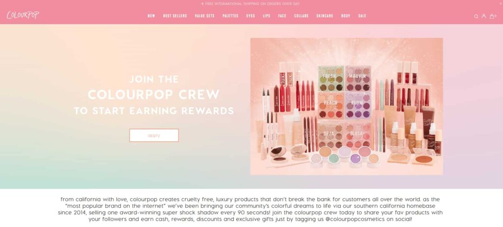
13. ColourPop
It’s a beauty brand offering a wide range of cosmetics. They have a very vibrant affiliate landing page to suit the tone of their business.
Takeaways to consider from this page:
- The page features a colorful and visually compelling design, capturing attention and engaging visitors effectively.
- By referring to affiliates as their ‘crew,’ the brand establishes a personal connection, cultivating a sense of belonging.
High-converting affiliate landing pages can boost your affiliate network. Use Afflr to design your page effortlessly
Conclusion
Crafting a compelling affiliate landing page thrives on captivating an affiliate’s attention, retaining it, and ultimately guiding them toward sign-up.
This blog provides various examples of affiliate landing pages, empowering you to study, analyze, and select the elements that best suit your specific business requirements.
Further Reading
- Ultimate Guide to Shopify Affiliate Marketing
- How to Create an Affiliate Program in Your Shopify Store
- 10 Best Shopify Affiliate Marketing Apps
- How can Referral Marketing benefit your Shopify Store?
Frequently Asked Question
A landing page for affiliates is a dedicated webpage designed specifically to promote and drive traffic to affiliate programs or products. It serves as a gateway for potential affiliates to learn more about the affiliate program and take action, such as signing up.
The best landing page for affiliate marketing depends on various factors such as target audience, the product or service being promoted, and marketing objectives. However, an effective landing page typically has clear and compelling content, a strong call-to-action, and a user-friendly design.
Creating a free affiliate marketing landing page can be done using website builders or affiliate marketing apps that offer free templates and easy no-code designing. You can choose a suitable template, customize it with your affiliate offer details and branding, and then publish it online.
A good landing page effectively communicates the value proposition of the program, has a clear and compelling call-to-action, is visually appealing, and is optimized for conversion. It should also be relevant to the target audience, easy to navigate, and mobile-friendly.
While it’s possible to promote an affiliate link without a landing page, using a landing page can significantly improve the effectiveness of your marketing efforts. A landing page allows you to provide more information about the program and drive conversions easily.
Yes, landing pages work for affiliate marketing and are an essential component for its success. A well-designed landing page can increase conversions by attracting the right kind of users.
