Have your DTC stores lost in the crowded e-commerce market? Thousands of brands struggle to get lost through badly designed websites, which need to be smoothly navigated or intuitive. Crappy websites annoy customers in the worst ways, getting lost conversions and battered brand loyalty
The key is mobile-friendliness for conversion and brand differentiation. The best direct-to-consumer stores have fantastic UI/UX designs that make e-commerce market websites both visually appealing and easy to navigate on any device. Today, shoppers are becoming mobile-first, so the experience needs to be seamless.
Here we’ll take you through six DTC stores that came together to make the best of the best, whether UI or customer experience. Mobile-optimized layouts and visual design are among all these examples, highlighting the best practices that drive conversion and loyalty.
You will gain actionable insights into improving your DTC stores’ UI design and mobile experience, thereby boosting their performance.
Want to Boost Your Conversions? Improve your store’s UI/UX with Afflr today!
Top UI recommendations for DTC websites
The user interface or UI design plays a very important role in the success of e-commerce DTC-based stores. It works as a bridge between the brand and the customers and improves customer experience with the e-commerce store’s interface.
In reality, Baymard Institute reports that the global cart abandonment rate currently stands at 69.57% with friction in the checkout as the major cause. Based on this ground, the friction points can be streamlined by making it rather seamless for a user to navigate products, complete a purchase, and return for another buy through optimal UI for DTC brands.
Mobile Optimization Matters
With more consumers shopping using their phones, an optimized mobile-first strategy for DTC stores is the way ahead. Mobile-friendly, responsive design and touch-friendly interfaces ensure it is easy for customers to navigate on all kinds of devices, thereby reducing bounce rates and preventing lost sales.
For example, Glossier’s mobile application user interface features a seamless UI that guides users through the process of making a purchase. This keeps user frustration on a tighter leash, and they have clear images of products that engage mobile users, thus resulting in engagement and conversion.
A user-friendly site proves to drive conversions and supports loyalty for customers, who are sure to love sites that offer ease of use. There’s one sure path toward turning frustrated customers out of a mess or confusion when it comes to UI-may I suggest MGDB Parts and Services?
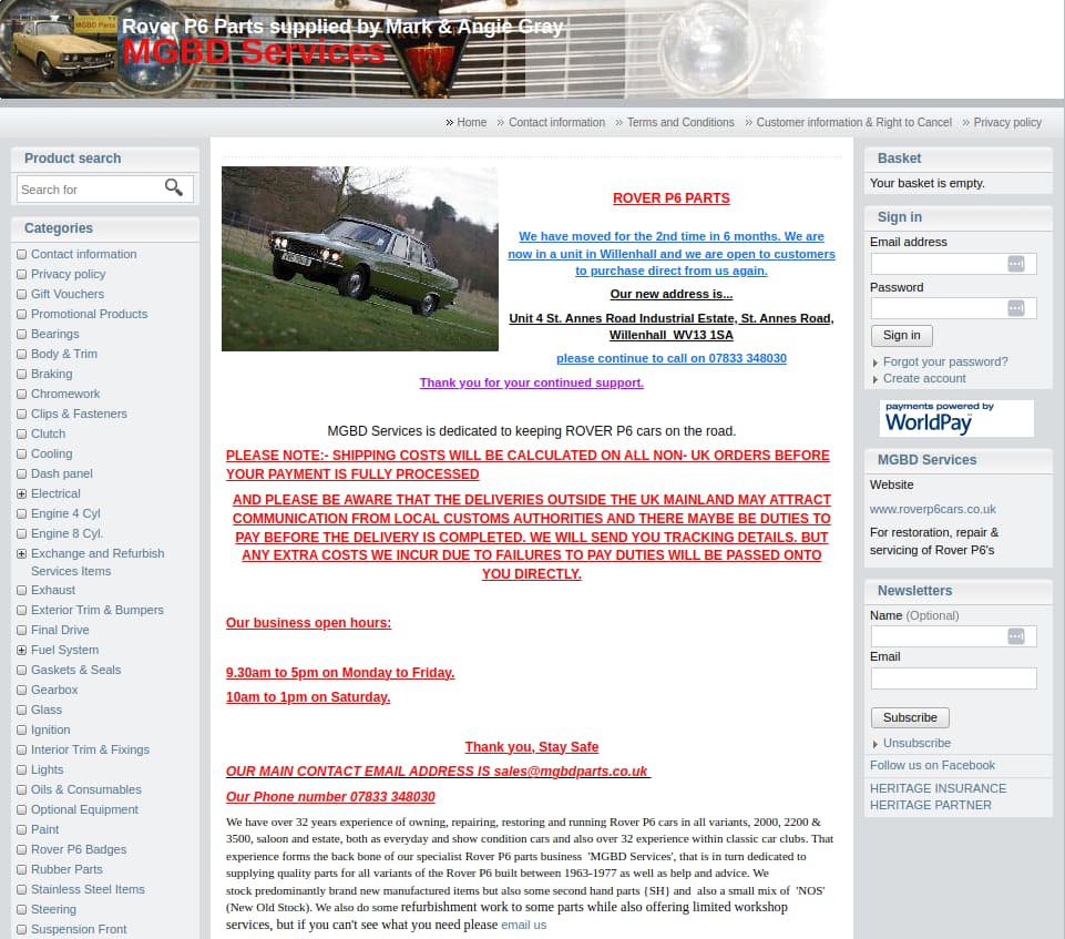
The heavy page composition will overwhelm the online shopper and cause them to abandon their session, along with all the potential sales opportunities. Your DTC stores can promote excellent customer satisfaction and drive better engagement by avoiding common UI pitfalls such as cluttered visuals and inconsistent design.
The best UI practices will get you a sharp and clean online presence for your DTC stores, leaving others behind in the sea of e-commerce market. If you are interested in reading about the best UI strategies, here are some of the most outstanding DTC stores that can be said to provide interfaces that transform the experience of the customers.
6 Top DTC Stores with Excellent UI for Improved Conversion Rates
DTC stores are performing extremely well on eCommerce, and it is the very reason because of the outstanding UIs offered by them. Optimizing a UI will enhance the entire shopping experience, which in turn creates customer engagement, increases conversion rates, and builds brand loyalty.
So, here are the top six DTC stores that have impressive UI designs along with valuable lessons that can make your online shopping experience remarkable.
1. Manscaped- Simple Navigation and Minimalistic Design
Manscaped stands out as a DTC winner in the men’s grooming category. The business has managed to create a great user experience through the design of a minimalist and very intuitive website.
Because of the very simple structure, customers will easily find what they are looking for; also, effective use of white space ensures that the design will not clutter up with a lot of information but present the products.

Key Takeaways from Manscaped’s UI Design for DTC Stores
- Whitespace to anchor attention: Bringing white space on either side of the product images and text to prominence, Manscaped makes it so that attention is brought logically to the parts without the user having to slog through extraneous or distracting information.
- Ease of Navigation: They do not clutter choice options to the users. Their navigational structure allows for an effortless shopping experience. It hastens the customer’s search process and finalizing a purchase.
Some of the major aspects Manscaped could bring to DTC stores are mobile-friendly designs and minimalist approaches; to provide an efficient, yet aesthetically pleasing user experience.
This interface caters more to mobile users, thereby becoming one of the model DTC stores.

Actionable Tip: Extremely basic and minimalist approach with maximal white space without any clutters and keeping the utmost importance of showing only a very few pages for these users.
2. Death Wish Coffee – Well-designed and great navigational features.
Death Wish Coffee, one of the strong DTC stores has a user-friendly interface in its blog. And so, the bold brand identity is equally well provided in this blog, and the clear, intuitive interface has even ensured easy navigation towards its content on mobiles.
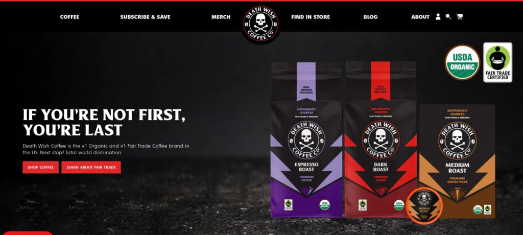
Death Wish Coffee Design Lessons for DTC Stores
- Mobile Responsiveness: Their blog is mobile responsive without losing readability or usability while navigating their content.
- Brand-Consistent Design: The user interface is crisp and clutter-free to highlight its ease of use while staying true to the brand personality.
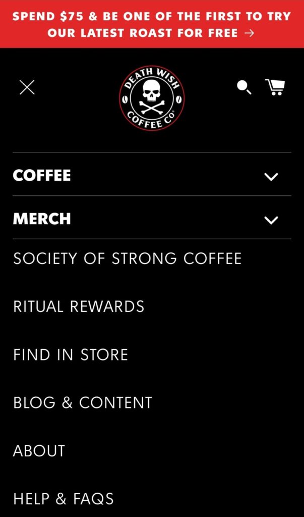
Why Death Wish Coffee Stands Out:
Death Wish Coffee’s website is the most beautiful example of branding coherence and mobile-friendliness with engagement for its users.
Maintaining a fully responsive UI as well as consistency in the brand tone, Death Wish Coffee shows DTC stores how to boost engagement and loyalty among customers.
Use Afflr’s optimized UI/UX features to drive more conversions and boost customer satisfaction in your store!
3. Best Self – More Personalization and Interactive Elements
Best Self is one of the best DTC stores, offering customers a highly personalized and interactive shopping experience.
The site is very well organized, which enables clients to easily find the needed products. This enhances customer loyalty and engagement.
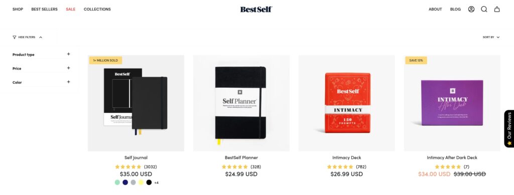
UI Insights from Best Self for DTC Stores
- Personalized Product Recommendations: The website suggests things based on the user’s past interactions. Adding a customized feel to every user session, the interface is pretty intuitive in the way it makes such suggestions.
- Interactive UI Features: Best Self has features like quizzes and recommendation engines, which make the site more engaging for users who browse productivity tools.

Why Best Self is Different
Best Self uses personalization and interactivity to engage with its users. It is making browsing feel more customized and user-centric. This is how DTC stores can improve user satisfaction and conversion rates.

Actionable advice: Quizzes or recommendation engines could be your way of providing unique shopping experiences that help products to be discovered.
4. Alex and Ani – Clear Navigation and Smooth Checkout Process
Alex and Ani one of the eco-friendly jewelry-providing DTC stores, emphasizes having an intuitive and clean checkout process. Their fast UI ensures that customers find it very easy to browse and purchase without multiple issues. This in return reduces the cart abandonment rate, thus increasing conversions.
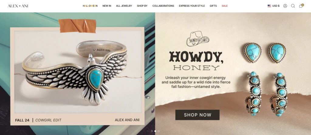
Lessons from Alex and Ani’s UI
- Streamlined checkout: this website checkout process is faster, engaging with fewer check-out steps minimizing cart abandonment
- Accurate progress Bar: A check-out uses a progress bar to help customers who will have navigated across checkouts on how much to take at any single point while undertaking a fully shopped check.
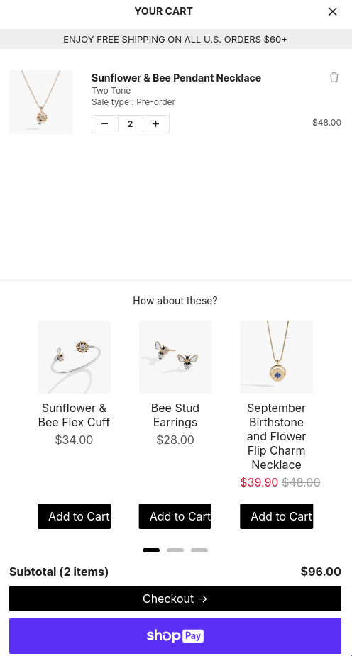
Alex and Ani is an amazing DTC store that has been working hard to make the check-out experience as smooth as possible. The brand has zeroed in on the achievement of simplification and minimum amount of distractions that could elevate user experience and convert sales.
5. Blvck Paris – Consistent Visual Branding and Luxury Feel
Blvck Paris is one of the most fashionable DTC stores that maintains, on its website, quite perfectly a visually harmonious, luxurious brand experience. The UI of the website is designed to produce a memorable user experience while it reflects the refined, elegant style of the brand.
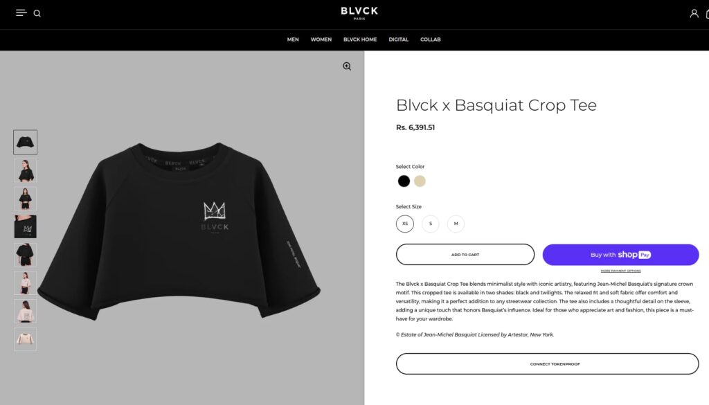
What DTC Stores Can Learn from Blvck Paris’s UI Consistency
- Quality Visuals and Branding: High-resolution imagery and a slick black-and-white palette are very close definitions of a minimalist aesthetic of Blvck Paris.
- Uniform Design Across Pages: The same color scheme and layout are highly engaging and create a trust factor for branding, keeping the visitors engaged with the content of the pages.

Why Blvck Paris stands out
Consistent branding by Blvck Paris makes its user interface both beautifully and memorably consistent.
For a DTC store, the luxury brand can be visualized through an all-encompassing and homogeneous design aesthetic that may bring brand loyalty.
BActionable Tip: A consistent design language that defines through colors, fonts, and layouts is great for strengthening a brand’s identity and trust. Customers.
6. Lunya – Fast Loading Responsive Design
Lunya is one of the other DTC stores that is famous worldwide for sleepwear and has a high-performing fast-load website with absolutely responsive designs so crucial to no bounce, improving user satisfaction.
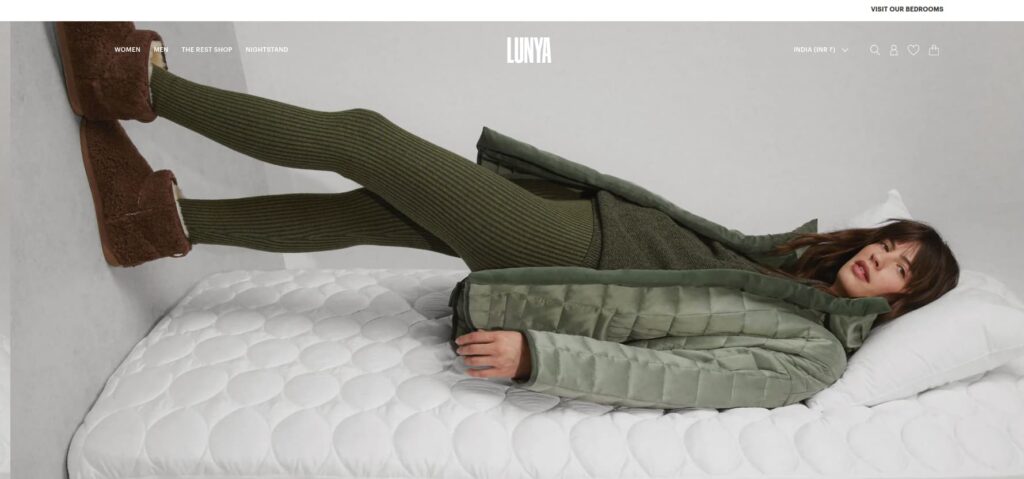
UI Strategies from Lunya for Optimizing DTC Performance
- Fast Page Loading: Lunya optimizes images and reduces heavy design elements so that the website loads very fast on any mobile device.
- Responsive Design On Cross-Platforms: The website designed responsively ensures functionality with all devices, and in this way, provides user experience consistency for each device.
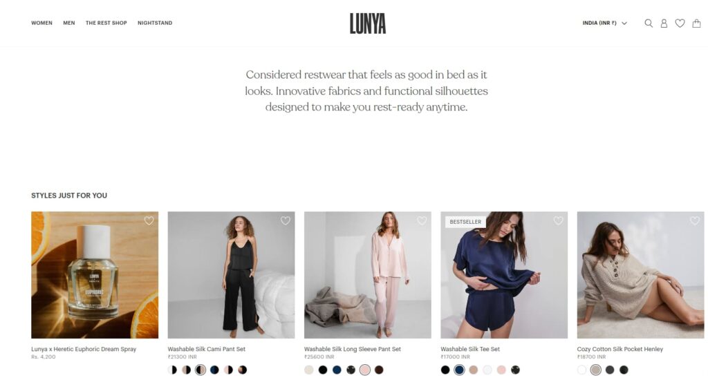
Why Lunya?
Loading speed and responsiveness have gained prominence as the utmost needs of DTC websites if they want to continue and reduce bounce rates in addition.
A fast responsive-friendly site keeps users engaged or converted, so performance-efficient Lunya is a standard.
Actionable tip: Optimize images and kill unnecessary code for faster loads, but speed is still the main aspect of mobile retention.
How Great UI of DTC Stores Boosts Customer Experience and Retention
Great UI means an improvement of the e-commerce shopping experience and massive retention rates, with strong repeat buys. Here is how an awesome UI/UX design can change things for your DTC stores to improve customer interactions and loyalty.
Importance of Great UI Design
A streamlined, intuitive UI is important for DTC stores, making the shopping journey more enjoyable and efficient. Key benefits include:
- Enhanced Customer Experience: Simplifies product discovery and supports a smoother path to purchase.
- Increased Retention Rates: Engaging UI keeps customers coming back, building loyalty and driving long-term retention.
Focus Areas for DTC Brands
To deliver a seamless online shopping experience, DTC brands should focus on the following:
- Easy to navigate: Prominent and consistent pathways make it easier for customers to search and navigate to find what they are looking for.
- The cohesive, attractive design of the website: creates appeal and fosters brand loyalty for discovery and creditability with the store
Elements of Great DTC UI/UX
- Easy Seamless Interface: Obvious navigation and interactions should be very simple so that the journey is easy to complete from the landing page through checkout.
- Mobile Optimization: With mobile shopping on the rise, your site needs to be responsive on mobiles and have speed to load quickly. Other tools you can use are Google’s Mobile-Friendly Test to speed up.
- Simple and Minimalistic Design Trends: Opt for a minimalistic design that’s not distracting, which means high usability and allows the visuals of the product to come into the limelight.
- User Path Considerations: Create a user path to address various customer needs-from new customers to repeat buyers. Use clear calls to action, keep page flows logical, and be consistent in the visuals.
- Simplified Checkout Process: Reduce friction by cutting back on checkout steps, providing options for guest checkout, and including secure payment solutions.
Actionable Tips for DTC Stores
- Optimize for Mobile: Make sure your site loads fast and provides a mobile-responsive design for a seamless experience across devices.
- Streamline the Checkout Process: Using Shopify’s Checkout Extensions or WooCommerce’s Checkout Add-Ons can eliminate steps and increase conversion.
- Consistency Across Pages: Use the same design elements and terms throughout your site to prevent confusion and create a seamless brand experience.
Is your affiliate platform’s UI limiting growth? Build user-friendly affiliate programs with Afflr to smooth your journey.
Conclusion
UI has been mastered by the leading DTC brands, bringing about a much greater benefit to customers in terms of experience and sales. For example, focusing on the interactive DTC website provides an engaging shopping environment, which captures the interest of customers.
Intuitive navigation design is key: one that makes it easy to browse and make purchases as efficiently as possible to make customers loyal and repeat themselves.
In addition, mobile-friendly DTC stores are all about speed and responsiveness, and it is what the main essentials of a successful DTC digital strategy look like.
This blog on DTC stores gives you insights that tell you to focus on speed, responsiveness, and design optimization which is crucial to boosting customer satisfaction, engagement, and conversions.
By investing in exceptional UI design, DTC brands can build lasting customer relationships and thrive in a competitive market.
Further Reading
- 11 Best Customer Referral Program Examples for DTC Shopify Store
- 14 Best Shopify Affiliate Program
- 14 Best Free Shopify apps to build your e-commerce store
- 8 Best Product Review Apps for Shopify
Frequently Asked Question
UI design plays a critical role in DTC sales by improving the user experience. A well-designed interface enhances navigation, speeds up the shopping process, and makes it easier for customers to find and purchase products, ultimately leading to higher conversions.
Key best practices include intuitive navigation, mobile optimization, fast loading times, and minimalistic design. Ensuring that the site is visually appealing and easy to use is essential for keeping customers engaged and driving sales.
With the rise of mobile shopping, having a mobile-accessible DTC website is crucial for providing a seamless online shopping journey. It ensures customers have a smooth experience across all devices, increasing the chances of repeat business.
Interactive features like product filters, personalized recommendations, and engaging visuals enhance the shopping experience, making the website more engaging and user-friendly.
Top DTC brands prioritize UI/UX design, mobile optimization, and digital experience optimization to deliver a seamless, engaging shopping journey that keeps customers satisfied and boosts sales.
